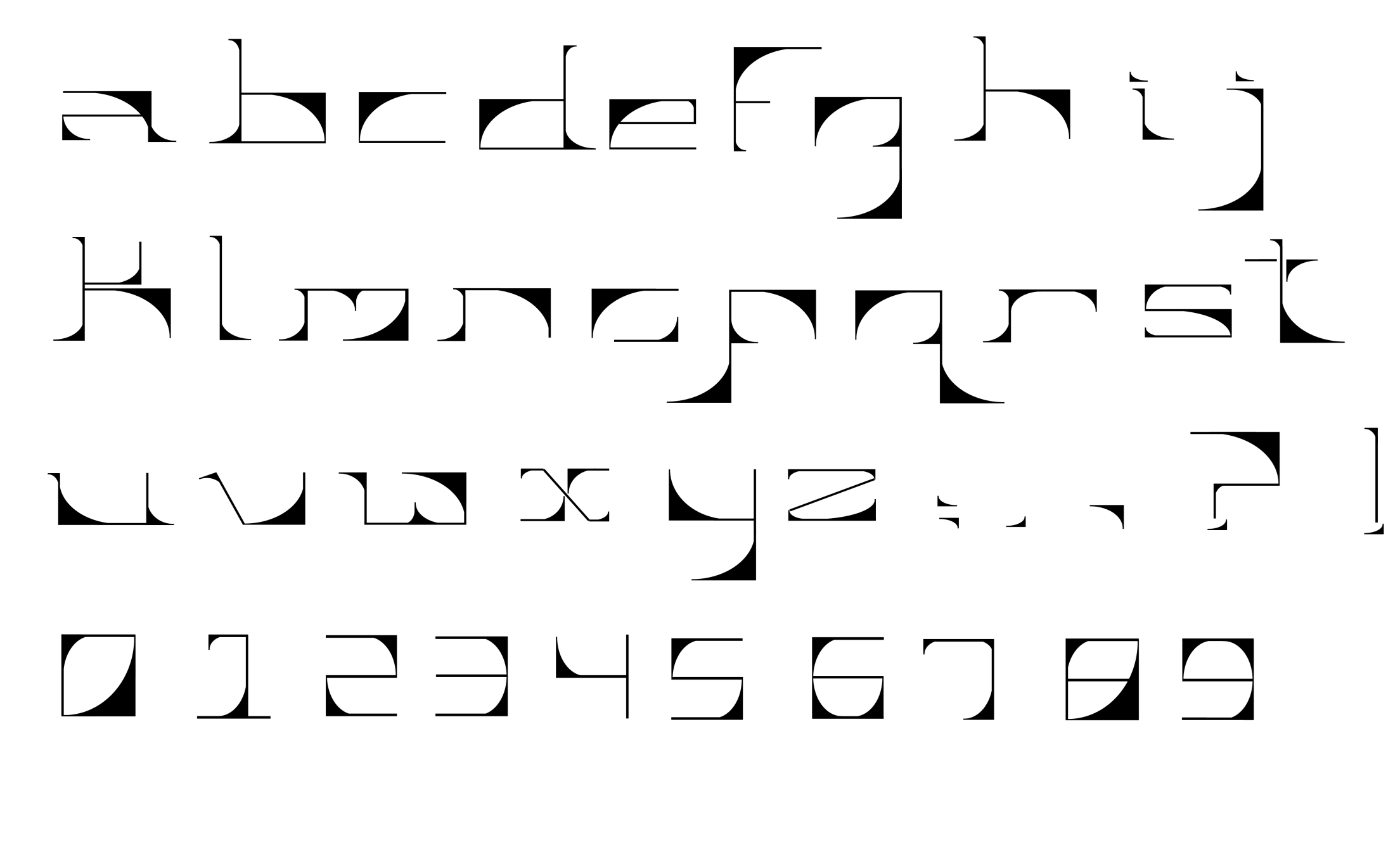
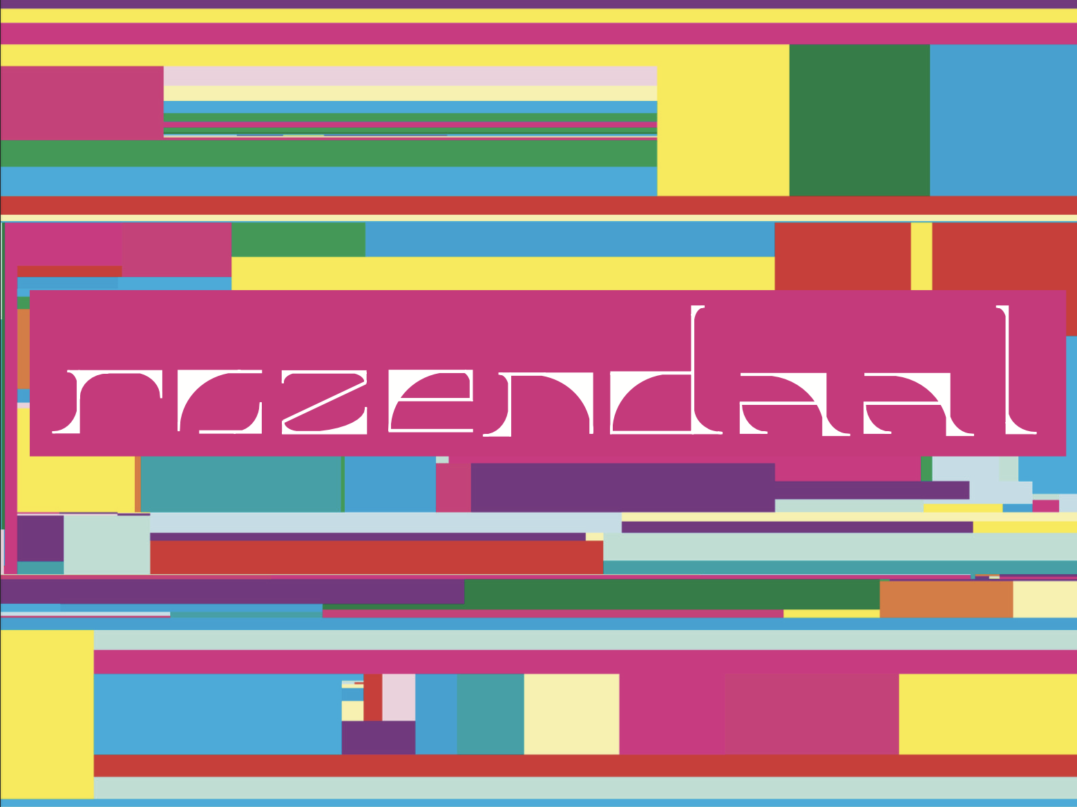
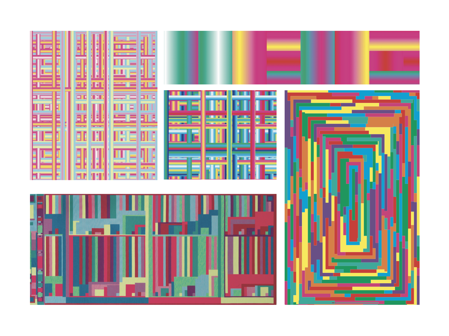
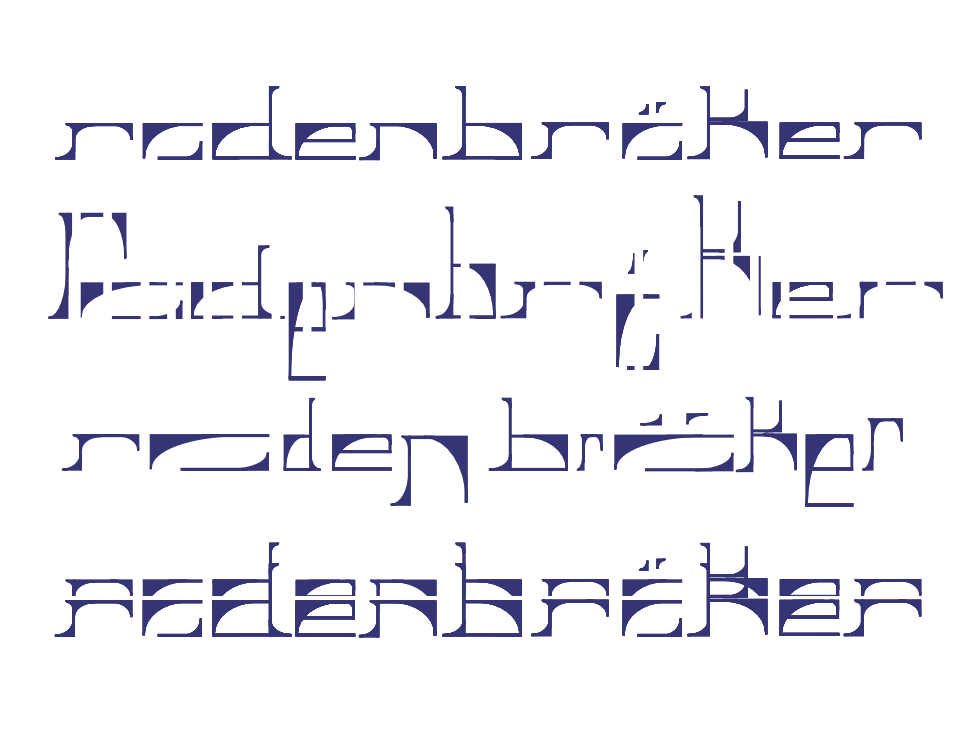
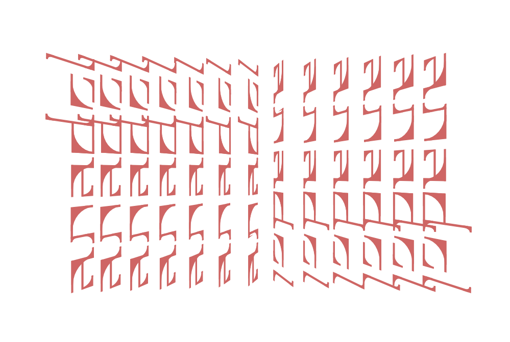
For this project, I designed Fractura, a modular typeface built using only four distinct modules. With this self-imposed constraint, I explored how type design can balance structure and creativity. To showcase the typeface as an artistic element, I created an accordion flip book featuring famous digital designers and artists in tech, using Fractura to enhance their stories. Additionally, I developed a series of visual pieces inspired by mathematical curves, such as the Peano curve, integrating the rigid modular system with fluid, organic forms.
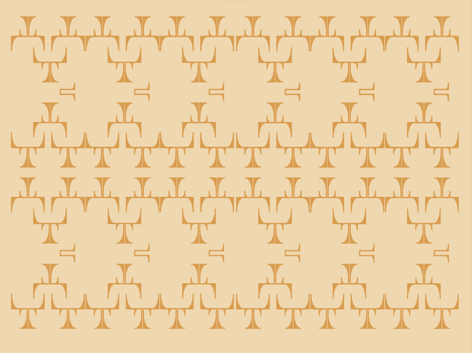
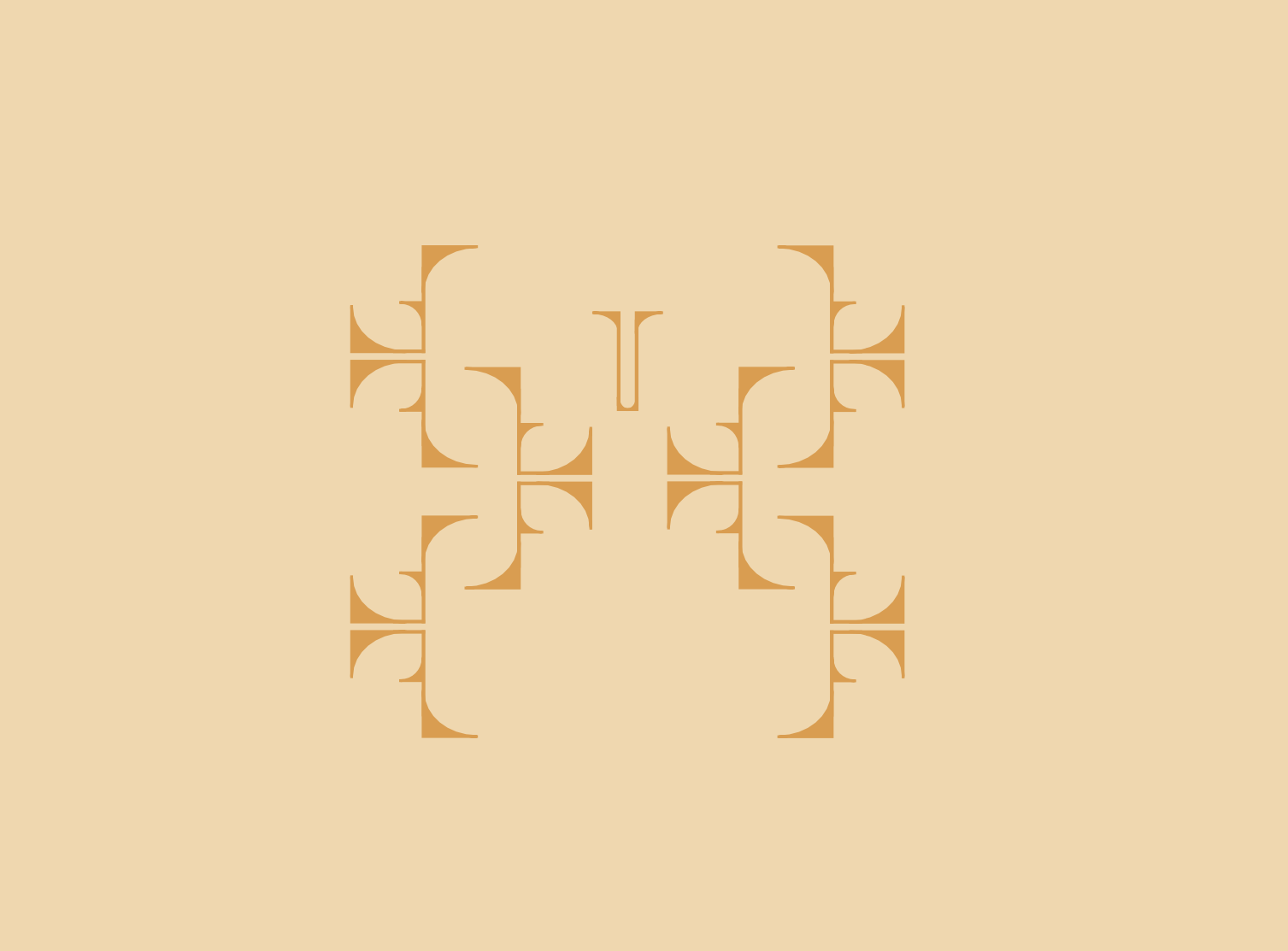
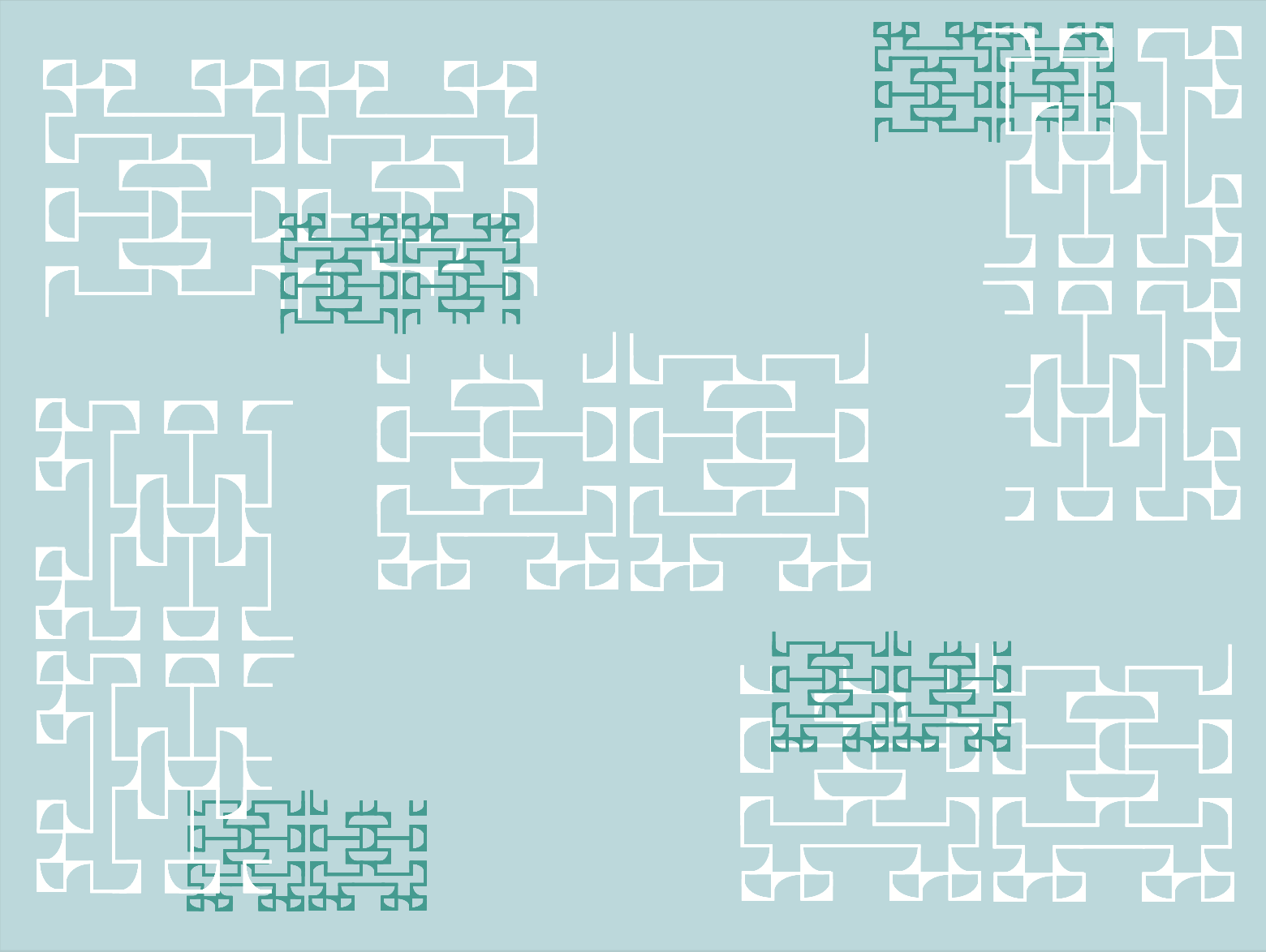
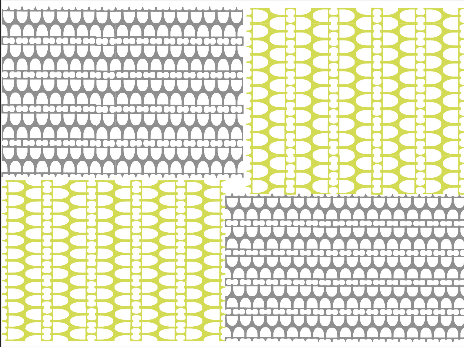
I began by constructing Fractura with a strict grid system, ensuring that all letterforms were derived from the same four modules. This approach emphasized consistency while allowing for creativity within constraints. In the accordion book, I used the type not just for text but as a visual motif, playing with scale, layering, and abstraction to reinforce the themes of the featured designers. For the mathematical curve-inspired pieces, I experimented with how the modular structure of the typeface could contrast yet complement organic, continuous forms.
Expanding this project could include animating Fractura to showcase its modular construction dynamically or developing an interactive tool that allows users to build their own compositions with the typeface. Additionally, experimenting with different printing techniques or digital applications, such as generative design, could push its artistic potential further.